National Zoo Style Guide
Text Styles
Heading 1
Heading 2
Heading 3
Heading 4
Heading 5
Paragraphs are in Open Sans font.
Paragraph: Lorem ipsum dolor sit amet, consectetur adipiscing elit. Proin efficitur feugiat dolor, nec scelerisque mi dictum id. Phasellus nisi tortor, pellentesque non diam eget, tempor viverra tellus. Vestibulum pharetra quam at magna efficitur tempus. Nam auctor quis eros efficitur aliquet.
Blockquote
Lorem ipsum dolor sit amet, consectetur adipiscing elit. Integer posuere erat a ante.
Callout Box
Callout box content goes here.
Lists
- Lorem ipsum dolor sit amet
- Consectetur adipiscing elit
- Integer molestie lorem at massa
- Facilisis in pretium nisl aliquet
- Nulla volutpat aliquam velit
- Phasellus iaculis neque
- Purus sodales ultricies
- Vestibulum laoreet porttitor sem
- Ac tristique libero volutpat at
- Faucibus porta lacus fringilla vel
Margins and Padding
Whitespace can be added to any html element by adding a class. The classes are constructed by pulling three parts together and separating by dashes. Example: .margin-left-xs. - this means to set the margin on the left to .25em.
For the first part of the class name, the choices are 'margin' or 'padding'. The second part is where you want the spacing and the choices are: top, right, bottom, left, x (left and right), y (top and bottom) and nothing (all 4). The last part specifies the size and the choices are: xs, sm, md, lg, and xl - and these translate to .25em, .5em, 1em, 1.5em and 3em.
Full list of classes:
.padding-xs { padding: .25em; } .padding-sm { padding: .5em; } .padding-md { padding: 1em; } .padding-lg { padding: 1.5em; } .padding-xl { padding: 3em; } .padding-y-xs { padding: .25em 0; } .padding-y-sm { padding: .5em 0; } .padding-y-md { padding: 1em 0; } .padding-y-lg { padding: 1.5em 0; } .padding-y-xl { padding: 3em 0; } .padding-x-xs { padding: 0 .25em; } .padding-x-sm { padding: 0 .5em; } .padding-x-md { padding: 0 1em; } .padding-x-lg { padding: 0 1.5em; } .padding-x-xl { padding: 0 3em; } .padding-top-xs { padding-top: .25em; } .padding-top-sm { padding-top: .5em; } .padding-top-md { padding-top: 1em; } .padding-top-lg { padding-top: 1.5em; } .padding-top-xl { padding-top: 3em; } .padding-right-xs { padding-right: .25em; } .padding-right-sm { padding-right: .5em; } .padding-right-md { padding-right: 1em; } .padding-right-lg { padding-right: 1.5em; } .padding-right-xl { padding-right: 3em; } .padding-bottom-xs { padding-bottom: .25em; } .padding-bottom-sm { padding-bottom: .5em; } .padding-bottom-md { padding-bottom: 1em; } .padding-bottom-lg { padding-bottom: 1.5em; } .padding-bottom-xl { padding-bottom: 3em; } .padding-left-xs { padding-left: .25em; } .padding-left-sm { padding-left: .5em; } .padding-left-md { padding-left: 1em; } .padding-left-lg { padding-left: 1.5em; } .padding-left-xl { padding-left: 3em; } .margin-xs { margin: .25em; } .margin-sm { margin: .5em; } .margin-md { margin: 1em; } .margin-lg { margin: 1.5em; } .margin-xl { margin: 3em; } .margin-y-xs { margin: .25em 0; } .margin-y-sm { margin: .5em 0; } .margin-y-md { margin: 1em 0; } .margin-y-lg { margin: 1.5em 0; } .margin-y-xl { margin: 3em 0; } .margin-x-xs { margin: 0 .25em; } .margin-x-sm { margin: 0 .5em; } .margin-x-md { margin: 0 1em; } .margin-x-lg { margin: 0 1.5em; } .margin-x-xl { margin: 0 3em; } .margin-top-xs { margin-top: .25em; } .margin-top-sm { margin-top: .5em; } .margin-top-md { margin-top: 1em; } .margin-top-lg { margin-top: 1.5em; } .margin-top-xl { margin-top: 3em; } .margin-right-xs { margin-right: .25em; } .margin-right-sm { margin-right: .5em; } .margin-right-md { margin-right: 1em; } .margin-right-lg { margin-right: 1.5em; } .margin-right-xl { margin-right: 3em; } .margin-bottom-xs { margin-bottom: .25em; } .margin-bottom-sm { margin-bottom: .5em; } .margin-bottom-md { margin-bottom: 1em; } .margin-bottom-lg { margin-bottom: 1.5em; } .margin-bottom-xl { margin-bottom: 3em; } .margin-left-xs { margin-left: .25em; } .margin-left-sm { margin-left: .5em; } .margin-left-md { margin-left: 1em; } .margin-left-lg { margin-left: 1.5em; } .margin-left-xl { margin-left: 3em; }
Colors
(and table)
Color | Hex Code | Usage |
---|---|---|
#66686A | Primary gray color (All text) | |
#FAF8F3 | Primary white color (top header/tickets bar) | |
#D9CFB3 | Primary tan color | |
#60768E | Primary blue color (headings) | |
#2A7AB0 | Button, Link Color | |
#627e9c | Conservation color | |
#C44D58 | Education color | |
#F26B6C | Membership color | |
#5AC4BE | Support color | |
#C8DC65 | Animals color | |
#F18B21 | Visit color |
Knockout Colors
Color | Hex Code | Usage |
---|---|---|
knockout | #5c5d5d | Default Knockout |
Knockout | #c44d58 | Red Knockout |
Knockout | #2975a9 | Blue Knockout |
Image Styles
No Style: Full Size Images
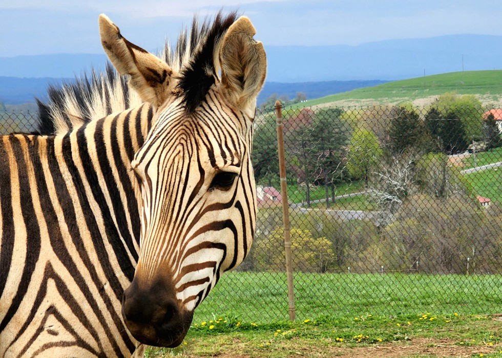
Images without a style are rendered in full size with a maximum width at 100% so that they do not expand outside of the page. The "content-image" class will be applied automatically. Click the Switch to plain text editor link to view your HTML code. It should read:
<img alt="alttext" src="imgsource" class="content-image" />
Testing a caption here
Lorem ipsum dolor sit amet, consectetur adipiscing elit. Proin efficitur feugiat dolor, nec scelerisque mi dictum id. Phasellus nisi tortor, pellentesque non diam eget, tempor viverra tellus. Vestibulum pharetra quam at magna efficitur tempus. Nam auctor quis eros efficitur aliquet. Quisque auctor neque vel ligula vulputate volutpat. Morbi metus odio, tincidunt nec dignissim quis, sodales ac turpis. Sed et turpis dapibus, tincidunt massa vitae, ultrices lacus.
Style: Image Left
Select the "Image Left" style for a 45% width, left aligned responsive image. Text will wrap around the image. Click the Switch to plain text editor link to view your HTML code. It should read:
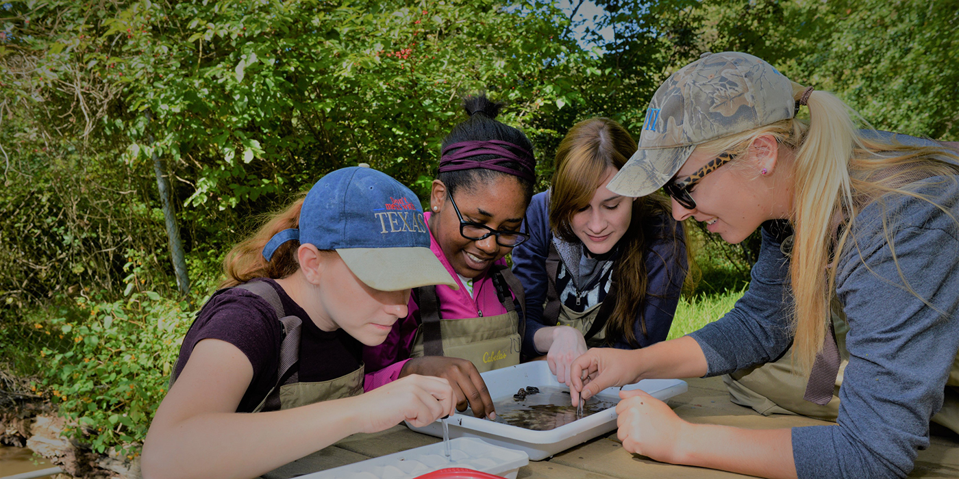
<p><span class="img-left"><img alt="alttext" src="imgsource" class="content-image" /></span>Begin paragraph text here...</p>
Lorem ipsum dolor sit amet, consectetur adipiscing elit. Proin efficitur feugiat dolor, nec scelerisque mi dictum id. Phasellus nisi tortor, pellentesque non diam eget, tempor viverra tellus. Vestibulum pharetra quam at magna efficitur tempus. Nam auctor quis eros efficitur aliquet. Quisque auctor neque vel ligula vulputate volutpat. Morbi metus odio, tincidunt nec dignissim quis, sodales ac turpis. Sed et turpis dapibus, tincidunt massa vitae, ultrices lacus.
Headings will wrap too
Lorem ipsum dolor sit amet, consectetur adipiscing elit. Proin efficitur feugiat dolor, nec scelerisque mi dictum id. Phasellus nisi tortor, pellentesque non diam eget, tempor viverra tellus. Vestibulum pharetra quam at magna efficitur tempus. Nam auctor quis eros efficitur aliquet. Quisque auctor neque vel ligula vulputate volutpat. Morbi metus odio, tincidunt nec dignissim quis, sodales ac turpis. Sed et turpis dapibus, tincidunt massa vitae, ultrices lacus.
Style: Image Right
Select the "Image Right" style for a 45% width, right aligned responsive image. Text will wrap around the image. Click the Switch to plain text editor link to view your HTML code. It should read:
<p><span class="img-right"><img alt="alttext" src="imgsource" class="content-image" /></span>Begin paragraph text here...</p>
Lorem ipsum dolor sit amet, consectetur adipiscing elit. Proin efficitur feugiat dolor, nec scelerisque mi dictum id. Phasellus nisi tortor, pellentesque non diam eget, tempor viverra tellus. Vestibulum pharetra quam at magna efficitur tempus. Nam auctor quis eros efficitur aliquet. Quisque auctor neque vel ligula vulputate volutpat. Morbi metus odio, tincidunt nec dignissim quis, sodales ac turpis. Sed et turpis dapibus, tincidunt massa vitae, ultrices lacus.
Headings will wrap too
Lorem ipsum dolor sit amet, consectetur adipiscing elit. Proin efficitur feugiat dolor, nec scelerisque mi dictum id. Phasellus nisi tortor, pellentesque non diam eget, tempor viverra tellus. Vestibulum pharetra quam at magna efficitur tempus. Nam auctor quis eros efficitur aliquet. Quisque auctor neque vel ligula vulputate volutpat. Morbi metus odio, tincidunt nec dignissim quis, sodales ac turpis. Sed et turpis dapibus, tincidunt massa vitae, ultrices lacus.
Style: Image Left Small
Select the "Image Left Small" style for a 33% width, left aligned responsive image. Text will wrap around the image. Click the Switch to plain text editor link to view your HTML code. It should read:
<p><span class="img-left-small"><img alt="alttext" src="imgsource" class="content-image" /></span>Begin paragraph text here...</p>
Lorem ipsum dolor sit amet, consectetur adipiscing elit. Proin efficitur feugiat dolor, nec scelerisque mi dictum id. Phasellus nisi tortor, pellentesque non diam eget, tempor viverra tellus. Vestibulum pharetra quam at magna efficitur tempus. Nam auctor quis eros efficitur aliquet. Quisque auctor neque vel ligula vulputate volutpat. Morbi metus odio, tincidunt nec dignissim quis, sodales ac turpis. Sed et turpis dapibus, tincidunt massa vitae, ultrices lacus.
Headings will wrap too
Lorem ipsum dolor sit amet, consectetur adipiscing elit. Proin efficitur feugiat dolor, nec scelerisque mi dictum id. Phasellus nisi tortor, pellentesque non diam eget, tempor viverra tellus. Vestibulum pharetra quam at magna efficitur tempus. Nam auctor quis eros efficitur aliquet. Quisque auctor neque vel ligula vulputate volutpat. Morbi metus odio, tincidunt nec dignissim quis, sodales ac turpis. Sed et turpis dapibus, tincidunt massa vitae, ultrices lacus.
Style: Image Right Small
Select the "Image Right Small" style for a 33% width, right aligned responsive image. Text will wrap around the image. Click the Switch to plain text editor link to view your HTML code. It should read:
<p><span class="img-right-small"><img alt="alttext" src="imgsource" class="content-image" /></span>Begin paragraph text here...</p>
Lorem ipsum dolor sit amet, consectetur adipiscing elit. Proin efficitur feugiat dolor, nec scelerisque mi dictum id. Phasellus nisi tortor, pellentesque non diam eget, tempor viverra tellus. Vestibulum pharetra quam at magna efficitur tempus. Nam auctor quis eros efficitur aliquet. Quisque auctor neque vel ligula vulputate volutpat. Morbi metus odio, tincidunt nec dignissim quis, sodales ac turpis. Sed et turpis dapibus, tincidunt massa vitae, ultrices lacus.
Headings will wrap too
Lorem ipsum dolor sit amet, consectetur adipiscing elit. Proin efficitur feugiat dolor, nec scelerisque mi dictum id. Phasellus nisi tortor, pellentesque non diam eget, tempor viverra tellus. Vestibulum pharetra quam at magna efficitur tempus. Nam auctor quis eros efficitur aliquet. Quisque auctor neque vel ligula vulputate volutpat. Morbi metus odio, tincidunt nec dignissim quis, sodales ac turpis. Sed et turpis dapibus, tincidunt massa vitae, ultrices lacus.
Image List Styles
Advanced: Take a look at the HTML to replicate. Images must be resized to achieve a uniform look.
Western Toad Research
The western toad is a species of conservation concern and is susceptible to disease and pollution. Scientists are monitoring a population of toads to determine how construction activities may influence the local environment. The team tests toads for disease, looks for growth abnormalities, and determines how project areas may create or destroy their habitat.
Restoration Research
Along the pipeline route researchers are identifying species and habitats that are rare or sensitive to disturbance and recommending ways to eliminate or reduce impact. The project team is also planning to test restoration techniques to advise project management on the best methods to restore natural communities on the pipeline after construction.
Alpine Research
The pipeline will be constructed over mountains, which is unprecedented for coastal British Columbia. Alpine plants are sensitive to disturbance and take a long time to re-colonize disturbed areas. In collaboration with a Canadian university, Smithsonian scientists are exploring techniques to restore soils and plants in hopes that this will also help restore alpine animal communities.
Camera-Trapping Large Mammals
The natural gas plant is being built in a location that supports a diversity of large mammals. Researchers use camera traps to determine daily and seasonal behavior of the species present, and then use this information to reduce conflict between human and wildlife interests.
Adding a file to a text field
Here is the ancient style guide of long ago times: Download
Responsive Videos
Make your embedded videos responsive by copying the code below. Be sure to change the src and title values.
<div class="embed-responsive embed-responsive-16by9"><iframe class="embed-responsive-item" src="//www.youtube.com/embed/R0q5vvPpS9A" title="Kiwi Video">Video</iframe></div>
Example:
Contact form modals
Include a link to a contact form within a page by using the below code.
<a class="ctools-use-modal" href="/modal_forms/nojs/webform/WEBFORM_NID" rel="nofollow">contact us</a>Example:
Paragraphs Module Elements
To add these items, select Paragraph Type under the OTHER CONTENT section.
Multicolumn Layouts
Use the class of double-trouble on the container to get a 2 column layout.
Example:
- Item
- Item
- Item
- Item
Tooltips
Use the code below to create a tooltip.
<button class="btn btn-primary" data-placement="left" data-toggle="tooltip" title="Tooltip on left" type="button">Tooltip on left</button>Example:
Popovers
Use the code below to create a popover. If you include data-html="true" then the content in the popover can include html, like links.
<button class="btn btn-primary" data-toggle="popover" title="Header text in popover" data-content="popover text goes here" data-html="true" type="button">Tooltip on left</button>Example:
Another Example:
- music icon example
This is a content slideshow
Frequently Asked Questions
I think four but in some circles it might be something else I don't know.
Eh, probably soccer. I like watching football. Cheerleading is pretty awesome too.
Icon Card Grid Display
Alerts
Alerts come in three flavors, informative, warnings and critical.
Info
Warning
Critical
Sticky Navbar Example
Two Column Layout
Editors can select a 2 column layout in the content area. The columns can be equal width or either column wider than the other (in a 38/62 or 62/38 ratio). This layout is available as a paragraph type called 'Two Columns'. Both text blocks and single media with caption paragraph types can be added in the columns although more options may be available in the future.
Below is an example using a 38% left column and a 62% right column. On mobile devices, the layout switches to single column with the left column on top.
Card Grid w/out Image Caps
Simple text cards can be displayed in a grid format.
To implement, in Paragraphs choose 'Card Grid' and then 'Card Item Blank'.
Multicolumn Text
This paragraph component allows you to create a newspaper-like layout where items span multiple columns. It is typically used in alphabetized bulleted lists to make sure each column is of equal height. The layout is responsive: 3 columns on wide screens, 2 on medium (or with a sidebar), and 1 on mobile devices.
To use, select 'Multi-column Layout (text)' in the paragraph type dropdown menu.
It can also be used on other content, for example, paragraphs or images, but this is still experimental. To give it a try make sure to wrap your newly created content in a 'div' tag. Otherwise, each paragraph will get divided into columns.
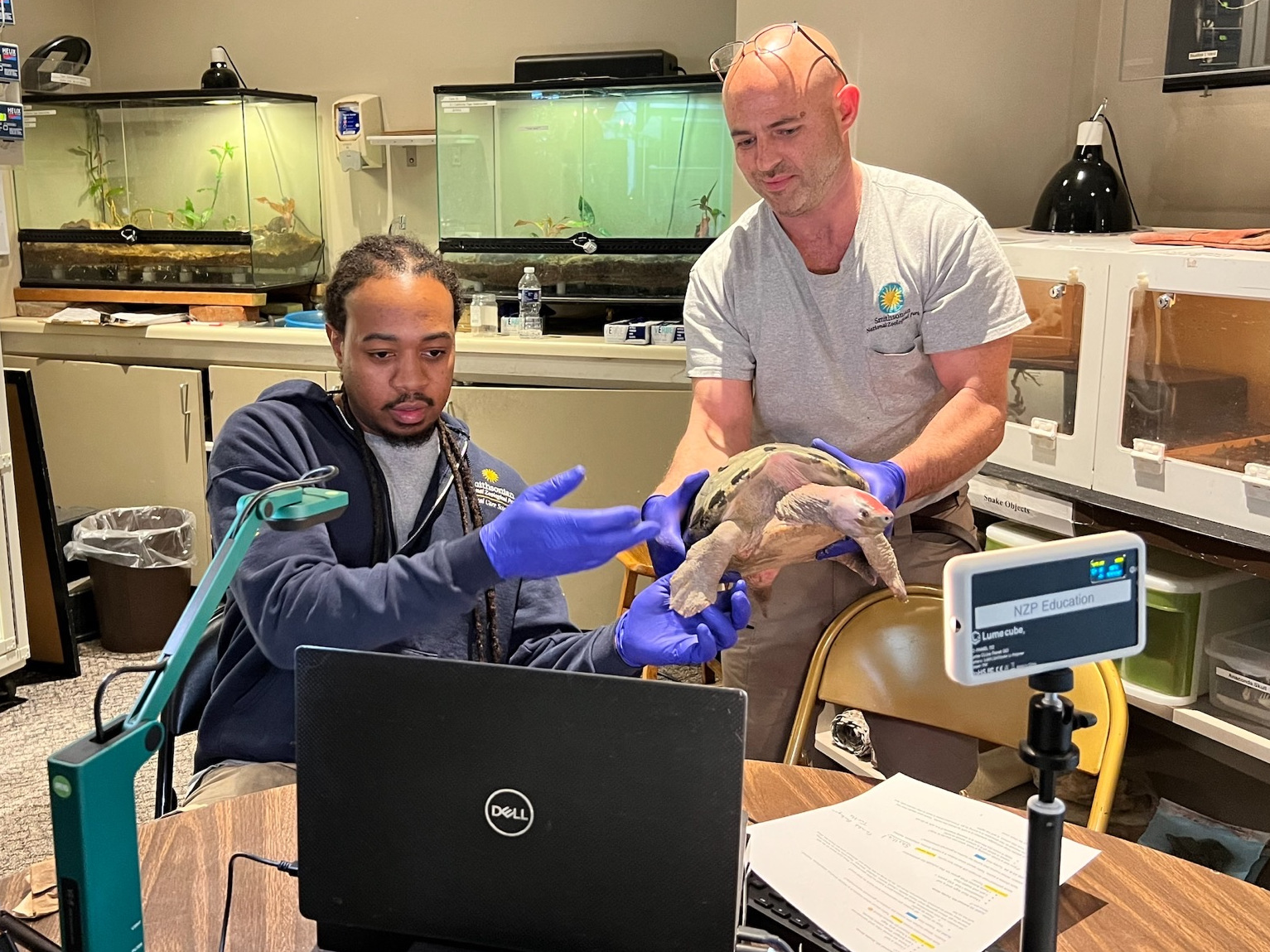
Example:
Horizontal Tabs
This paragraph component allows you to create a horizontal tab interface. Each tab comes with a label text field and a paragraph field that houses the tab content.
To use, select 'Horizontal Tabs' in the paragraph type dropdown menu.
Example:
Transaction Pages (currently, Membership)
Some pages are in the Tessitura/TNEW environment. Styling for them is via a html template and a css file. The css file can be edited at: https://nationalzoo.si.edu/admin/config/development/css-injector/edit/23
*Note that this file is scoped to not affect any Drupal pages via path (uses a made up url alias); and is also not part of the css aggregation (by having 'preprocess css' unchecked).